Just to be clear, we’re not trying to decide the best WordPress Page Builder here 😉
I’ve been experimenting with ChatGPT’s new image upload feature and thought I’d put it to the test by evaluating some website designs. Using a specially designed prompt, I compared the Bricks and Elementor websites to see what the AI would make of them.
The test was based on taking a screenshot of the entire front page of each website – not the small screenshots below.
Take a look at the results below. The AI has had its say – do you think it got it right? Let’s hear your thoughts 😀
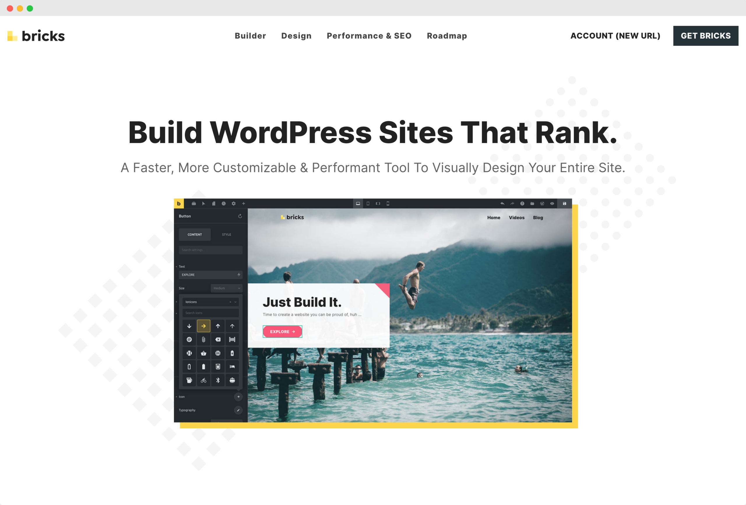
Bricksbuilder.io
Visual Hierarchy: 9/10
- The website presents a strong visual hierarchy, with a clear distinction between headers, sub-headers, and body text.
- The typographical scale appropriately differentiates sections and leads the eye logically through the content.
Color Scheme and Contrast: 8/10
- The color scheme is modern and professional, with good contrast for readability.
- Typography in white over dark sections and black over light sections enhances legibility.
Typography: 9/10
- Fonts appear web-safe and are legible across different devices.
- The pairing of sans-serif fonts works well, with a proper balance of weight and style.
- Headline-to-body text ratio is varied, contributing to the hierarchy effectively.
- Leading, kerning, and tracking seem consistent, aiding readability.
Imagery and Graphics: 9/10
- Images are of high quality, relevant, and support the textual content.
- Graphics and typography are well-integrated, neither overpowering the other.
Navigation and User Interface: 8/10
- Navigation seems intuitive, with clear typographic cues.
- UI elements are clearly labeled and easy to understand.
Layout and Composition: 8/10
- The spatial arrangement showcases a balanced composition.
- Typography contributes positively to this layout, helping to create a clean and organized feel.
Design Consistency: 9/10
- The design maintains a consistent theme throughout the page.
- Motifs and visual language are uniform, contributing to a cohesive user experience.
Content Presentation and Clarity: 8/10
- Information is well-organized, and the presentation is straightforward.
- The role of typography in hierarchy and legibility is evident and well executed.
Branding Consistency: 9/10
- The design and typography reflect a coherent brand image and message.
- The use of typefaces and the overall design aesthetic align with the brand’s identity.
Overall Aesthetics and Experience: 9/10
- The website has a modern and appealing aesthetic, with typography contributing significantly to the user experience.
- The design is engaging and provides a positive user experience.
Summary and Improvements:
The website scores highly across all criteria, showcasing a well-thought-out typographic approach that enhances both the user experience and the presentation of content. The visual hierarchy is well established through the use of scale and typeface variations. Color contrast is effectively used, aiding readability and user engagement.
One area of potential improvement is the Color Scheme and Contrast (Score: 8/10). While the contrast is generally good, there may be opportunities to use color to further guide the user’s attention to key areas or calls to action.
Overall Bricks Score: 86/100
The website’s design, especially in terms of typography, is of high quality. The total score of 86 out of 100 indicates that the website is well-designed with a few minor areas that could be refined to push it towards excellence. To improve, the site could explore slightly more dynamic use of color to enhance user navigation and focus. The website’s strengths in visual hierarchy and typography significantly contribute to an effective and pleasant user experience.
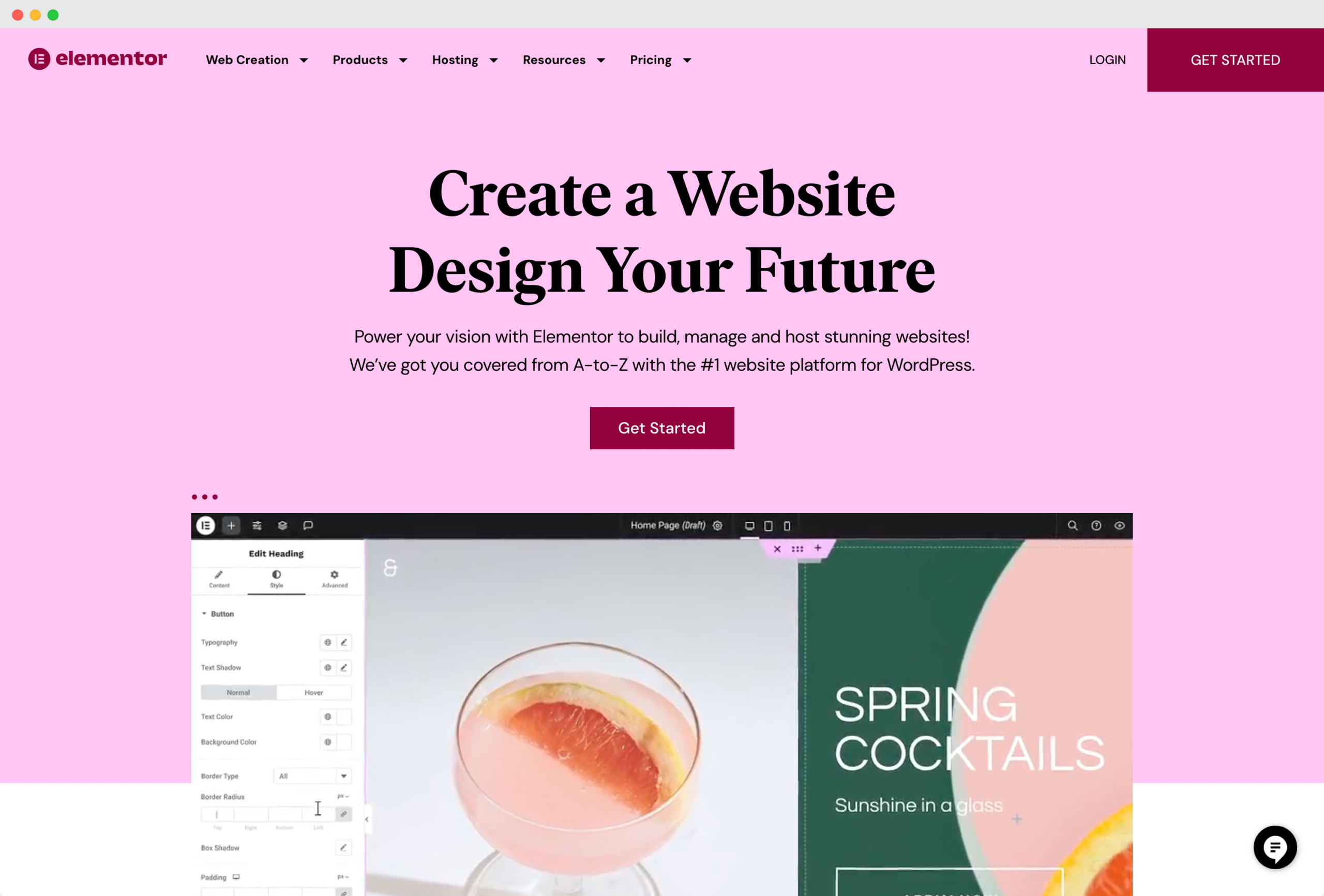
Elementor.com
Visual Hierarchy: 8/10
- The website employs a clear visual hierarchy, with large, bold headlines that grab attention and subheadings that guide the reader’s eye through the content.
- The typographic scale varies appropriately to signal importance, but some subheadings could stand out more to better delineate different sections.
Color Scheme and Contrast: 7/10
- The color palette is modern and attractive, with sufficient contrast for readability in most cases.
- However, some grey-on-pink text might be challenging for users with visual impairments.
Typography: 9/10
- The font types are modern and appear to be web-safe, aligning with the contemporary design aesthetic.
- Font combinations are thoughtfully chosen, with a clear distinction between headers and body text, although there is room for slightly better pairing to avoid monotony.
- The typographic scale is mostly well-executed, but some smaller text might benefit from increased size for readability.
- Leading, kerning, and tracking are appropriately set, enhancing legibility across most devices.
Imagery and Graphics: 8/10
- The images are high-quality and relevant, and they integrate well with the textual content, contributing to the site’s professional look.
- However, some text overlays on images could be more legible.
Navigation and User Interface: 9/10
- Navigation appears intuitive, with clear typographic cues that facilitate user interaction.
- The UI elements are labeled concisely, which aids in user experience.
Layout and Composition: 8/10
- The layout shows a good balance of text, images, and white space, contributing to an appealing composition.
- The typography adds to this balance but could be fine-tuned to perfect the flow.
Design Consistency: 7/10
- There’s a strong consistency in design elements, but there are minor discrepancies in the typographic treatment within buttons and call-to-action elements.
Content Presentation and Clarity: 7/10
- Content is organized logically, but the presentation can be overwhelming in denser sections.
- Typography plays a good role in hierarchy, but some sections could benefit from clearer distinction through better use of size and style.
Branding Consistency: 8/10
- The design and typography align with a modern, creative brand image, though the consistency of this branding through typography can be improved in certain areas with more uniform usage of styles.
Overall Aesthetics and Experience: 8/10
- The site’s overall aesthetic is professional and visually appealing, with typography contributing positively to the experience. However, refinement in typographic details could enhance the overall appeal.
Summary and Improvements:
The website is visually appealing and functions well in most typographic aspects. To improve:
- For sections with lower contrast, increase the contrast ratio to improve accessibility.
- Introduce a greater variety of font pairings to reduce monotony.
- Adjust the size of smaller texts and subheadings for better readability.
- Ensure all text over images is legible by using background shading or outlines.
- Standardize typographic treatments in calls to action and buttons for uniformity.
Overall Elementor Score: 79/100
The overall score indicates a well-designed website with a strong foundation in typography, though there is room for improvement. Focusing on enhancing contrast, typographic variety, and standardization can significantly improve the user experience.
Conclusion
In wrapping up, it’s clear that AI hasn’t quite mastered the art of website critique. But what we’re seeing is the beginning of something potentially game-changing. The technology is moving forward, and it’s not hard to imagine a future where AI could give us valuable insights into our web designs.
For providers of web design tools, there’s a real chance here to innovate. By incorporating AI into their products, they could offer designers a powerful new feature that helps streamline the design process and improves the end product.
So while AI isn’t a perfect web critic just yet, the direction we’re heading is exciting. It’s about using AI to support and enhance our own skills, not replace them. And as the technology gets better, it could become an essential part of every web designer’s toolkit.
Leave a Reply