Introduction
The Gutenberg editor is a modern content editor for WordPress that uses a block-based approach to build web pages. One of the blocks available in Gutenberg is the columns block, which allows users to create responsive, multi-column layouts.
Under the hood, the columns block uses Flexbox to manage the layout of the columns. Here’s how it works:
What is Flexbox?
Flexbox, short for Flexible Box Layout, is a powerful and versatile CSS layout module that makes it easy to create responsive and adaptive designs for web pages. In simple terms, flexbox is a tool that allows you to arrange and align elements on a web page with ease, regardless of the screen size or device.
Imagine arranging a group of items, such as text, images, or buttons, on a shelf. Flexbox works like an invisible shelf that helps you place and organize these items neatly and efficiently. With flexbox, you can control the direction, alignment, and spacing of these items to create visually appealing and responsive layouts.
Flexbox achieves this by turning a container element into a “flex container” and its immediate children into “flex items.” The flex container can automatically adjust the size and position of its flex items based on the available space, making it a breeze to create flexible and adaptable designs for various screen sizes.
- When you add a columns block to the editor, the outer container of the block is given a
display: flexstyle. This makes the container a flex container and the direct children of this container, the individual columns, become flex items. - The flex container automatically lays out its children (the columns) in a row direction by default, which is the desired behavior for a columns block.
- By using flexbox, the columns block can easily manage the distribution of space and alignment of its children. This helps ensure that the columns adapt to the available space and resize responsively.
- Flexbox also allows users to control the width of the individual columns, either by specifying a percentage width or by using the built-in options provided by the Gutenberg editor.
The Gutenberg columns block uses flexbox to achieve responsive, multi-column layouts that are easy to customize and adapt to various screen sizes. Flexbox provides an efficient way to manage the layout, alignment, and distribution of space within the columns block.
The history of Flexbox
Flexbox, short for Flexible Box Layout Module, was introduced to address the challenges web designers faced in building complex layouts with limited CSS tools. The journey of flexbox began in 2009 when Mozilla’s David Baron created the initial proposal, aiming to tackle layout problems that were difficult to solve using existing CSS techniques.
Incorporated into the CSS3 specification in 2012, flexbox gained traction within the web development community. The W3C refined the flexbox specification to make it more robust and easier to use. By 2013, flexbox was supported in some form by all major browsers, including Chrome, Firefox, Safari, and Internet Explorer (starting with version 10).
The introduction of flexbox marked a turning point in web design, enabling developers to create responsive and adaptive layouts with ease. Today, flexbox enjoys widespread browser support and has become an essential tool in modern web design, empowering developers to build complex layouts that cater to diverse devices and screen sizes.
But the Columns Block lacks some responsive controls that we need!
Mike McAlister (aka developer of the Ollie theme) puts this brilliantly in a blog post called A native and iterative approach to responsive control in WordPress. Mike highlights the importance of responsive design in WordPress and suggests utilizing core WordPress features and the Gutenberg block editor to create adaptable layouts.
He advocates for an iterative approach that involves making incremental improvements to enhance the user experience across different devices. By combining native WordPress functionality with continuous testing and optimization, developers can efficiently build responsive websites that cater to various devices and screen sizes.
In the meantime, we can use a little CSS 😀
How to reverse the Gutenberg Columns Block on mobile
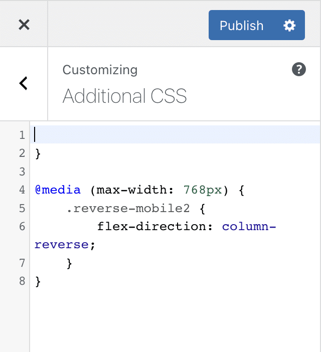
To reverse the columns layout on mobile devices, you can use a combination of flexbox and media queries. Here’s an example CSS code that demonstrates how to achieve this:
@media (max-width: 768px) {
    .reverse-mobile {
        flex-direction: column-reverse;
    }
}
The media query targets screen sizes with a maximum width of 767px (which typically covers most mobile devices) and changes the flex-direction property to “row-reverse”. This reverses the order of the columns, so they are displayed from right to left on mobile devices.
Please note that you need to adapt this CSS code to your specific HTML structure and class names. Also, you may need to adjust the breakpoint value (767px) based on your design requirements or the screen sizes you are targeting.
How to choose the order of 3 or 4 Column Block Layout on mobile
To control the order of a three or four-column layout on mobile devices, you can use a combination of flexbox and media queries. Here’s an example CSS code that demonstrates how to achieve this:
/* Custom order for columns layout on mobile devices */
@media (max-width: 767px) {
  .wp-block-column:first-child {
    order: 3;
  }

  .wp-block-column:nth-child(2) {
    order: 1;
  }

  .wp-block-column:nth-child(3) {
    order: 2;
  }

  /* Uncomment the following code if you have a four-column layout */
  /*
  .wp-block-column:nth-child(4) {
    order: 4;
  }
  */
}
In this example, the CSS code modifies the default Gutenberg columns block (.wp-block-columns) to use flexbox. The media query targets screen sizes with a maximum width of 767px (which typically covers most mobile devices) and sets custom order values for each column.
In this example, on mobile devices:
- The first column will be displayed third.
- The second column will be displayed first.
- The third column will be displayed second.
- (Optional) Uncomment the code for the fourth column if you have a four-column layout. In this example, it remains in its original position.
Please note that you need to adapt this CSS code to your specific HTML structure and class names. Also, you may need to adjust the breakpoint value (767px) based on your design requirements or the screen sizes you are targeting.
Other Gutenberg Blocks that use Flexbox
Apart from the columns block, several other Gutenberg blocks use Flexbox for layout and alignment purposes. These blocks leverage the power and flexibility of Flexbox to create responsive and adaptive designs. Some of the notable Gutenberg blocks that use Flexbox include:
- Buttons block: The Buttons block, which allows you to add multiple buttons side by side, uses flexbox to arrange the buttons within the container. This ensures that the buttons are aligned and spaced evenly, and it also allows you to control their alignment and direction.
- Navigation block: The Navigation block is used to create responsive navigation menus. Flexbox is utilized to align and distribute the menu items, ensuring a consistent layout and allowing for easy customization of the menu’s appearance.
- Media & Text block: The Media & Text block allows you to place an image or other media alongside a text block. Flexbox is used to control the layout and alignment of the media and text content, making it easy to create responsive designs that adapt to different screen sizes.
- Group block: The Group block is a container block that can hold multiple blocks inside it. While the Group block itself does not inherently use flexbox, you can add custom CSS to make it a flex container and use flexbox properties to control the layout and alignment of the blocks within the group.
- Social Icons block: The Social Icons block is used to display a row of social media icons. Flexbox is employed to arrange the icons and ensure that they are spaced evenly and aligned consistently.
Bonus – how to change the order of the Gutenberg Media and Text Block on mobile
To reverse the columns on the Gutenberg media and text block on mobile devices, you can use CSS Flexbox and media queries. Here’s an example of how you might do this:
/* Target the media and text block */
.wp-block-media-text {
  display: flex; /* Use Flexbox to control the layout */
  flex-direction: column; /* Stack the media and text elements vertically */
}

/* Reverse the columns on mobile devices */
@media (max-width: 767px) { /* Adjust the breakpoint value as needed */
  .wp-block-media-text {
    flex-direction: column-reverse; /* Reverse the order of the media and text elements */
  }
}
This CSS code will reverse the columns on the Gutenberg media and text block on mobile devices by stacking the elements vertically and reversing their order.
Conclusion
Flexbox is a powerful and versatile CSS layout module that simplifies the process of creating responsive and adaptive designs for web pages. By leveraging the flexibility and ease of use that flexbox provides, you can create complex layouts, control the order of elements, and ensure consistent alignment and spacing across different devices and screen sizes.
Using media queries in combination with flexbox, you can effectively adjust the layout and order of columns on mobile devices, providing an optimized user experience for various screen sizes. Gutenberg blocks in WordPress, such as the columns block, buttons block, and navigation block, also utilize flexbox to create responsive and adaptive layouts.
In summary, flexbox is an essential tool for modern web design, allowing you to create visually appealing and functional layouts that cater to the diverse range of devices and screen sizes in use today. By understanding and mastering flexbox, you can improve the quality and responsiveness of your web designs and ensure a better overall experience for your users.
Leave a Reply