Storefront Pro home page sliders are by default set to ‘cover’. This means that whatever text you put over them, the text won’t fall outside of the image behind it. This is especially important when being viewed on a mobile phone. Here’s an explanation on why it’s best practice to set background images to cover.
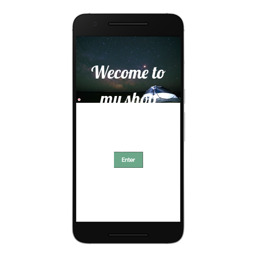
If we don’t set background images to cover then this will happen. The image isn’t cropped anymore, but it the height become so small (so it fits the width of the screen) that the text no longer fits. So the text drops below the image. This is bad.
Background image not set to cover (see how the text and button no longer fit within the image but drop below it)
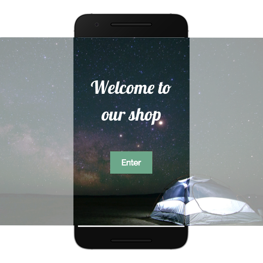
So to solve this we set the background image to ‘cover’. This means that the text always fits within the image, no matter what size. This is what is actually happening.
Background image set to cover
But this also has the result that the background image will appear cropped on some devices and screen resolutions.
However there may be times when you don’t want your background image to crop. It may be that you are just using an image, or you have designed the slider with text in the graphic.
And we can use a little bit of CSS magic to fix the ratio of your slider images.
We need to do a little simple maths first, but don’t worry it’s very simple 🙂
In my example below we’ll assume my slider image is 500px height, and 1500 width.
So we divide 500 / 1500 to get the ratio = .33
This sets it so that your slider images on your home page have a height that is equal to 33% of the viewport width (vw) which is also the slider width.
And here’s the resultant code (click here to get code)
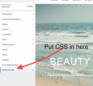
Put this code in the wordpress customizer (css section)
Just replace 33 below with your ratio
.home #page > nav.secondary-navigation ~ .header-hero,
.home #page .header-hero .storefront-pro-flexslider .slides li .slide-img {
    min-height: 33vw !important;
}
Leave a Reply