Introduction
Throughout history, great masters such as Leonardo da Vinci have used visual composition techniques to create stunning works of art.
These same techniques can also be applied to modern web design to create visually appealing and effective websites.
In this article, we will explore some of the key techniques that classical painters used and how they can be leveraged in website design.
Rule of Thirds
The rule of thirds is a classic compositional technique that involves dividing an image into thirds both horizontally and vertically.
The four points where the lines intersect are known as the “power points” and are considered the most visually compelling areas of the image.
Research suggests that people’s eyes are naturally attracted towards the points where grid lines intersect. As an artist, this information can be utilized to create a captivating painting that draws the viewers in, especially when incorporating unexpected elements or highlighting certain aspects.
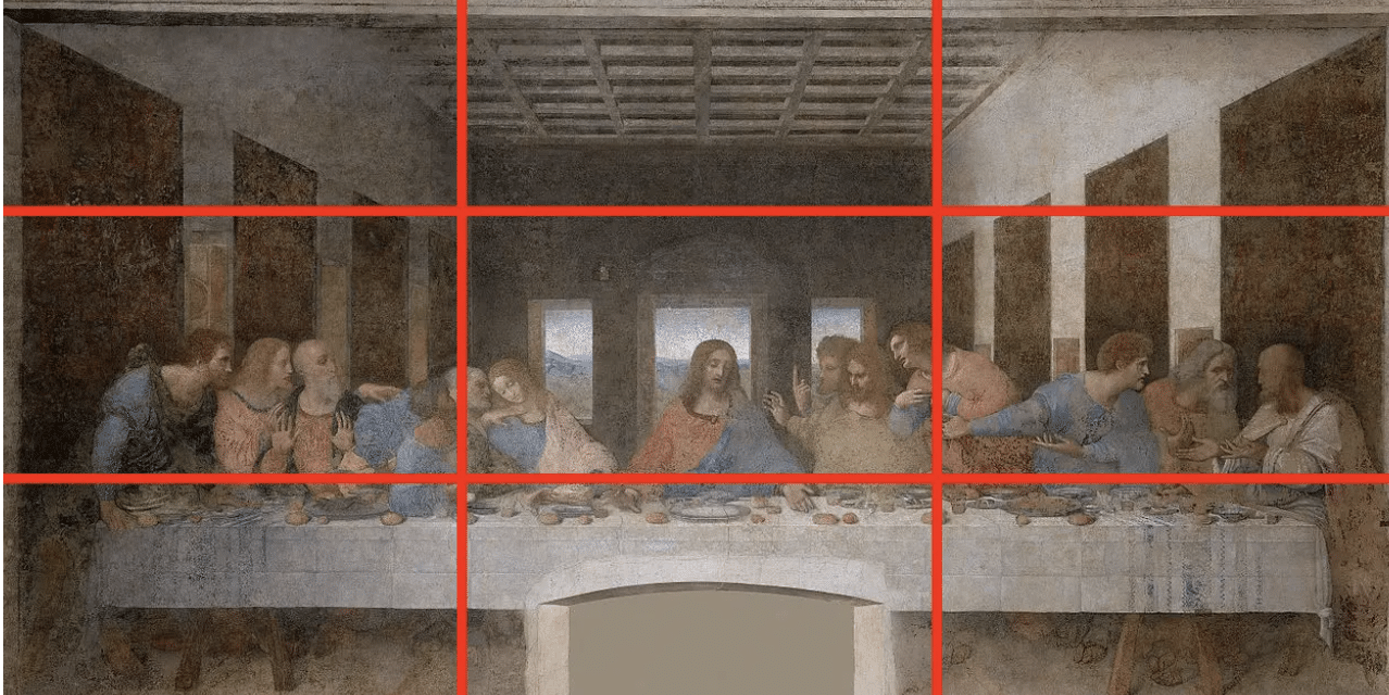
In “The Last Supper” by Leonardo da Vinci, the rule of thirds is used to create a balanced composition.
The table where the Last Supper takes place is positioned in the center of the painting, but it is not positioned in the exact center of the painting. Instead, the table is placed closer to the right-hand third of the painting, with Jesus positioned at the center point of the painting, which is also one of the power points of the rule of thirds.
This composition creates a sense of balance and draws the viewer’s eye towards the central figure of Jesus.
The rule of thirds can be a useful tool in web design to create visually appealing and balanced layouts.
Here are 5 ways in which the rule of thirds can be used in web design:
- Grid-based layout: Use a grid-based layout that is divided into thirds to help you place important elements on the intersections of these lines. This creates a sense of balance and helps draw the eye to important content.
- Image placement: When placing images on a web page, use the rule of thirds to determine their placement. Place the focal point of the image at one of the intersections of the grid lines to create a visually striking composition.
- Text alignment: Aligning text to the left or right third of the page can create a sense of balance and make it easier for users to read. This is because the eye naturally starts at the top left corner of a page and moves across to the right.
- Navigation placement: Placing navigation elements on one of the thirds can create a balanced and easy-to-navigate layout. This can be especially useful for mobile design, where screen real estate is limited.
- Responsive design: When designing for different screen sizes, keep the rule of thirds in mind to ensure that important content is still placed on the intersections of the grid lines, regardless of screen size.
A good example of modern web design that uses the rule of thirds is Adobe’s homepage.
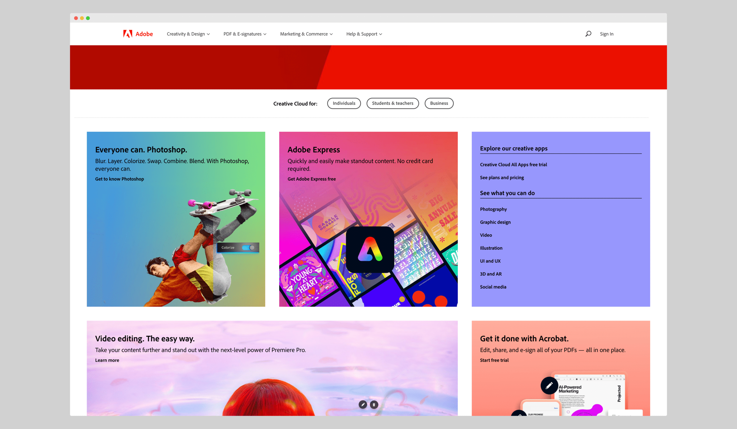
The hero image is divided into thirds, with the main product image located at the left power point.
Use of Light and Dark
The use of light and dark, or chiaroscuro, is a technique that involves creating contrast between light and shadow to add depth and dimension to an image. This technique can be used in web design to create visual interest and make certain elements stand out.
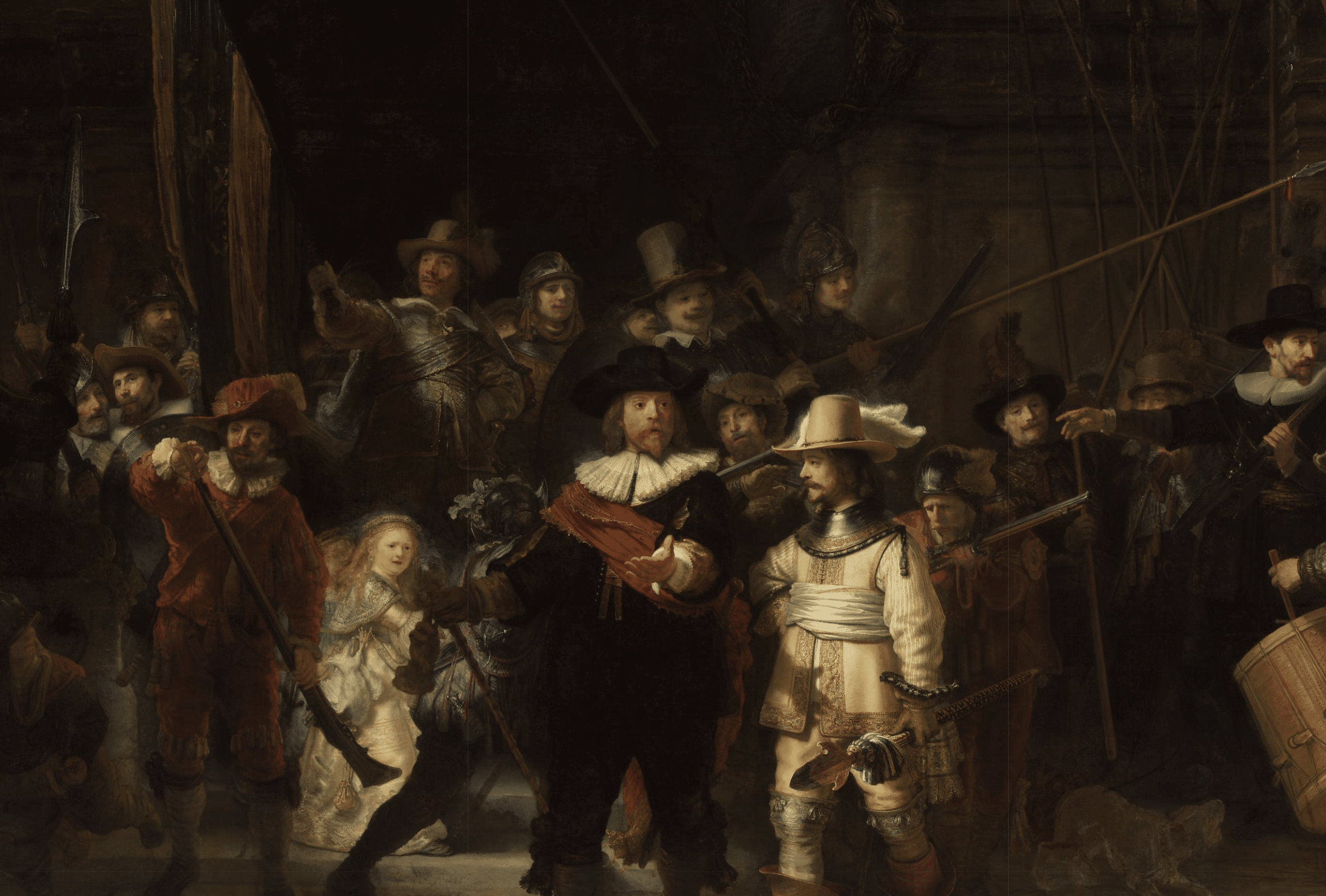
“The Night Watch” by Rembrandt is a masterpiece of chiaroscuro, which is the use of light and dark. In the painting, Rembrandt has created a strong contrast between the light and dark areas of the composition.
The light is used to illuminate the key figures of the painting, while the rest of the scene is bathed in shadow. The contrast between the light and dark areas of the painting creates a sense of drama and draws the viewer’s eye towards the central figures.
Rembrandt’s masterful use of light and dark creates a three-dimensional effect, with the figures appearing to emerge from the canvas. This technique adds depth and dimension to the painting and is a hallmark of Rembrandt’s style.
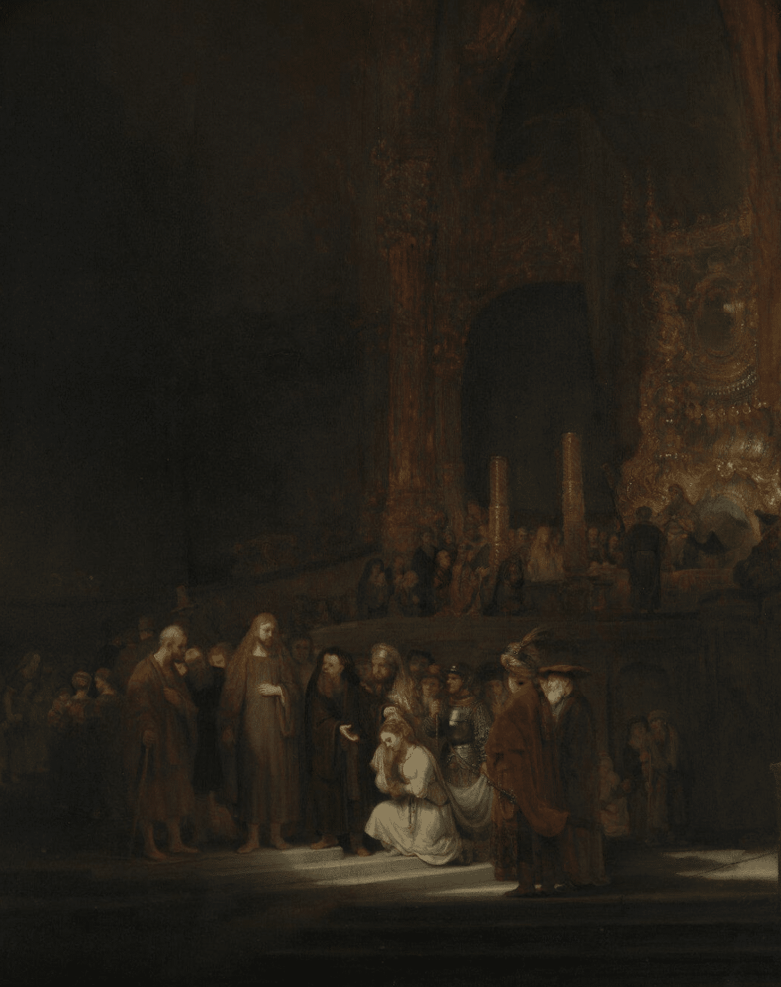
Another great example is his painting called ‘the woman taken in adultery’.
Here are five ways how light and dark can be used in web design
- Contrast: A high-contrast design with bright and dark elements can help draw attention to important elements such as calls to action or headings.
- Mood: A dark color scheme can be used to create a mood of sophistication, elegance or mystery, while a light color scheme can be used to create a more upbeat and playful feel.
- Depth: Using light and dark elements can create depth in a design, making it more visually interesting and dynamic.
- Hierarchy: By using light and dark elements to create contrast, designers can establish a clear visual hierarchy that guides the viewer’s eye through the design.
- Emphasis: Using light to highlight certain elements or dark to obscure others can help create emphasis, drawing the viewer’s attention to key areas of the design.
A good example of modern web design that uses the use of light and dark is Epic Games.
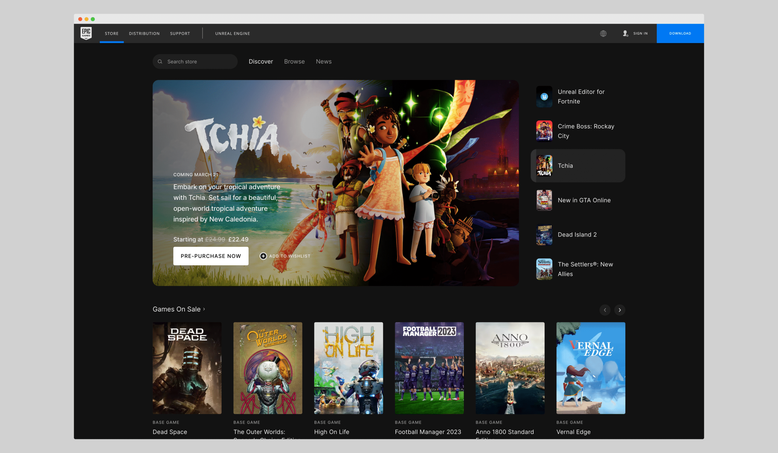
The Epic Games website uses a dark background to create a sense of excitement and energy. The use of light text and images creates a high level of contrast that draws the viewer’s eye toward important elements on the page, such as games and services.
Golden Ratio
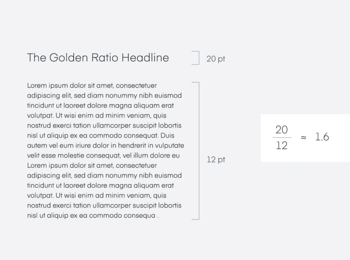
The golden ratio is a mathematical concept that has been used in art and design for centuries. It involves dividing an image into two parts so that the ratio of the smaller part to the larger part is the same as the ratio of the larger part to the whole. This creates a sense of balance and harmony that can be applied to web design to create a visually pleasing layout.
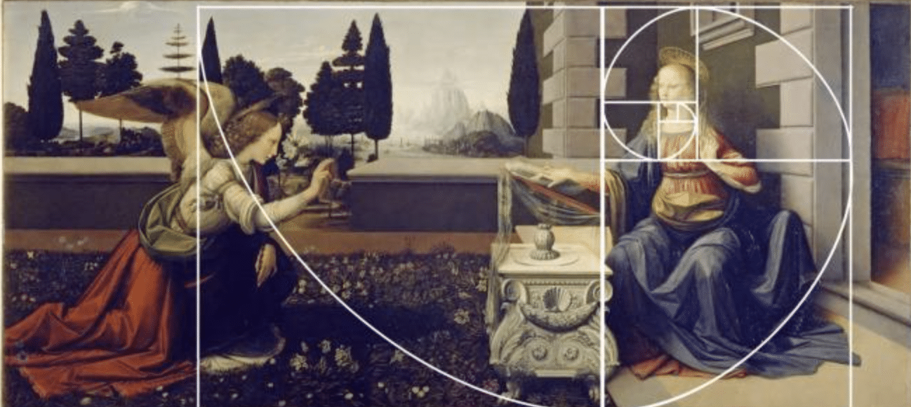
Leonardo da Vinci’s Annunciation painting, created in the 1470s, is believed to have used the golden ratio in its composition. The golden ratio is a mathematical ratio that appears in nature and has been used by artists and architects throughout history to create aesthetically pleasing compositions.
In the Annunciation, the golden ratio is used in the placement of important elements in the painting. The figure of the archangel Gabriel is positioned on the left-hand side of the painting, while the figure of the Virgin Mary is positioned on the right-hand side. The space between the two figures is divided in a way that follows the golden ratio, with Gabriel taking up about 2/3 of the space and Mary taking up about 1/3 of the space.
In addition, the use of perspective in the painting also follows the golden ratio. The vanishing point of the painting, where the lines of the architecture converge, is positioned at a point that follows the golden ratio.
Overall, Leonardo da Vinci’s use of the golden ratio in the Annunciation painting creates a sense of balance and harmony in the composition, which reinforces the religious significance of the scene. The use of the golden ratio helps to create a visually pleasing composition that draws the viewer’s eye toward the important elements of the painting.
Another example of the golden ratio is the Parthenon in Athens, Greece. The Parthenon is a temple that was built in the 5th century BC and is considered one of the greatest examples of classical architecture.
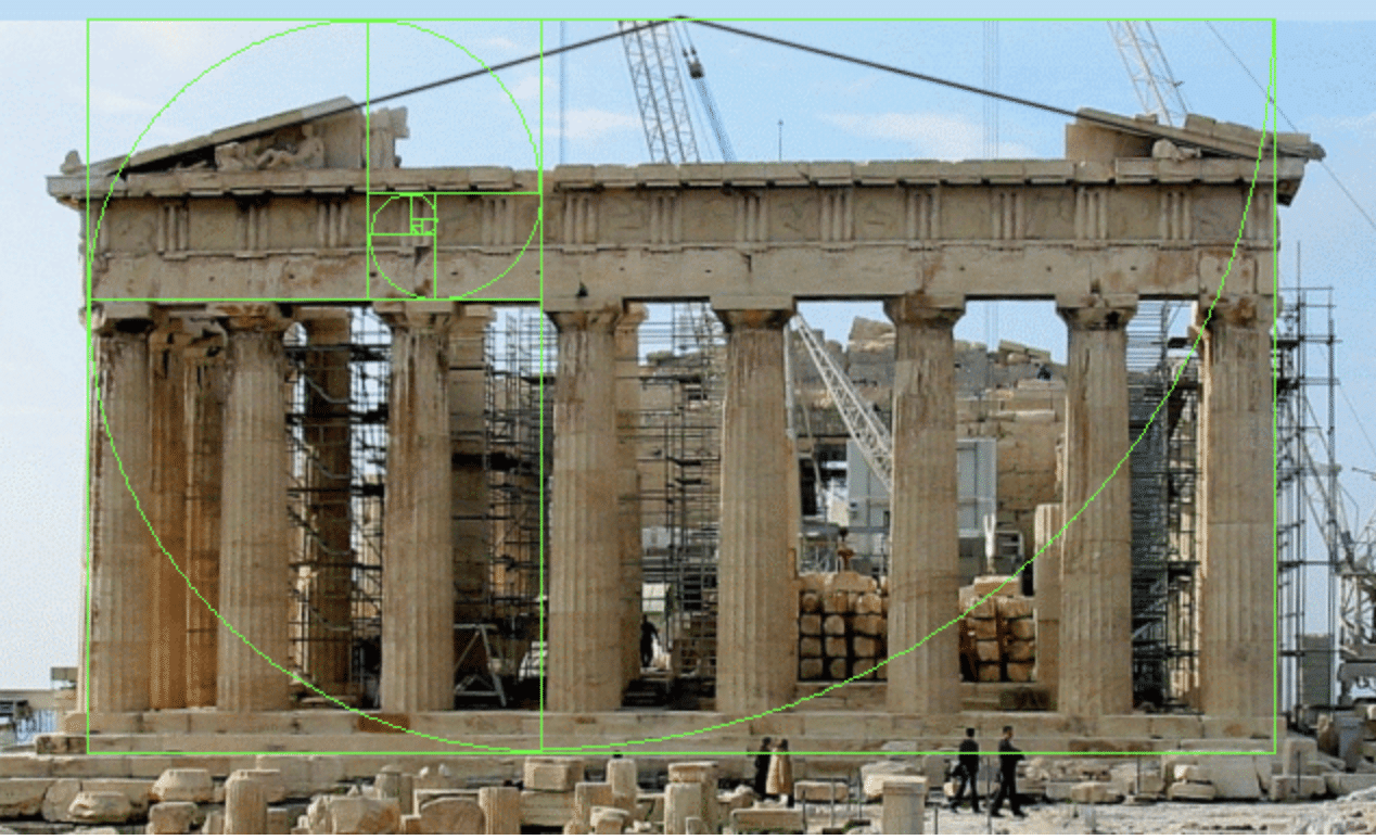
The columns of the Parthenon are designed using the golden ratio, with a height-to-width ratio of approximately 1.618:1. The column height is divided into two parts, with the lower part being taller than the upper part. This creates a subtle tapering effect that enhances the sense of height and grandeur.
In addition, the spacing between the columns is also designed using the golden ratio. The distance between each column is approximately 1.5 times the width of the column, creating a sense of balance and harmony.
Here are five ways the golden ratio might be used in web design:
- Layout: Using the golden ratio as a guide for layout can help create a visually appealing and balanced design. For example, you might use a grid system that is based on the golden ratio to determine the placement of elements on the page.
- Image cropping: Cropping images using the golden ratio can help create visually interesting compositions. For example, you might crop product images to the golden ratio to highlight important features.
- Icon design: Designing icons using the golden ratio can help create a sense of harmony and balance. For example, you might use the golden ratio to determine the proportions of icon elements.
- Responsive design: When designing for different screen sizes, using the golden ratio can help ensure that important elements are placed in proportionate positions on the page, regardless of screen size. This can help create a consistent and balanced user experience across devices.
- Typography: Applying the golden ratio to typography can help create harmonious proportions and improve readability. For example, you might use the golden ratio to determine the size of headings and body text.
Visual Hierarchy
Visual hierarchy is a crucial principle in visual arts and design, as it involves arranging visual elements in a deliberate manner to guide the viewer’s visual journey and highlight the most significant points. By strategically organizing visual elements, artists and designers can control the viewer’s attention and communicate the intended message with greater impact.
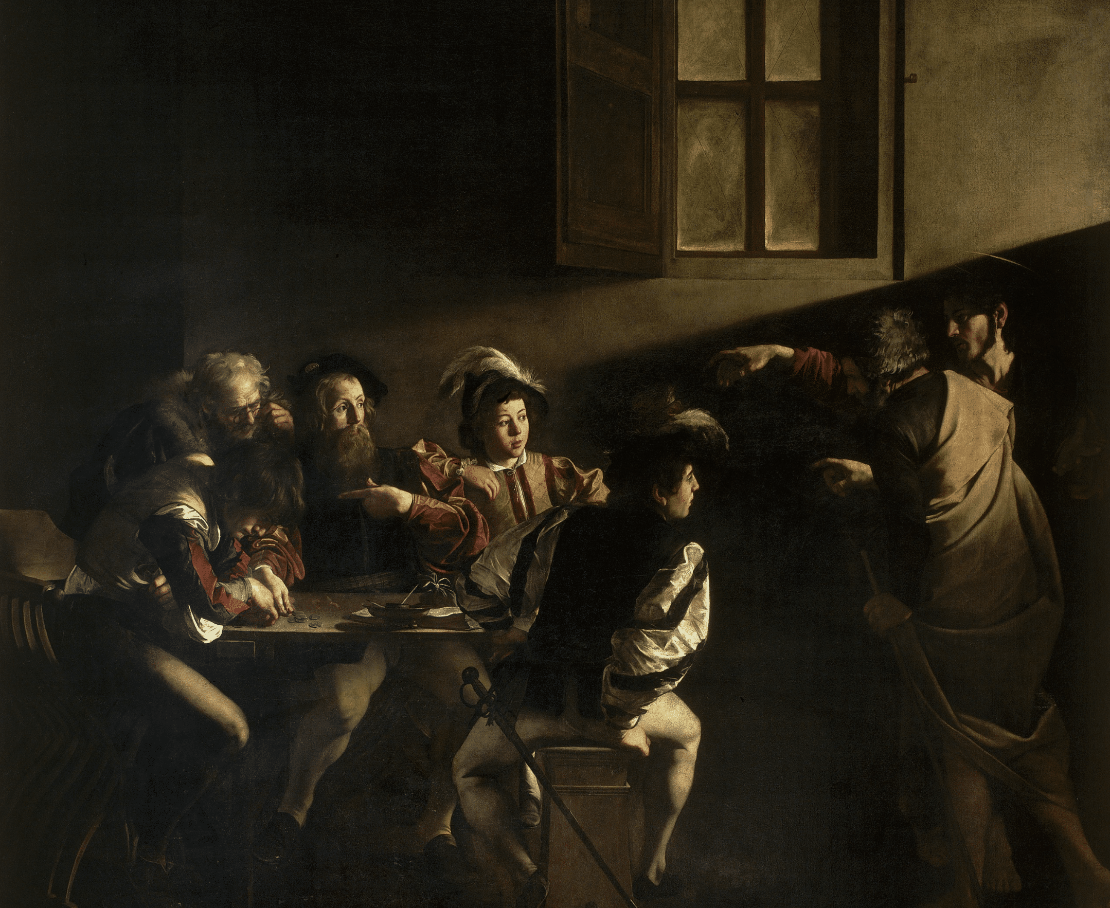
The Calling of St. Matthew” by Caravaggio uses visual hierarchy to draw the viewer’s attention towards the central figures of the painting. In the painting, St. Matthew is seated at a table with several other men, while Jesus and St. Peter are shown entering the room.
Caravaggio used several techniques to create visual hierarchy in the painting. Firstly, the light source in the painting is positioned above and to the left of the scene, illuminating the central figures of Jesus and St. Peter, who are positioned at the upper right-hand corner of the painting.
Secondly, Caravaggio has made St. Matthew’s face and body larger than the other figures in the painting, indicating his importance. Lastly, the positioning of the figures within the painting creates a clear hierarchy, with Jesus and St. Peter positioned higher than the other figures and in a position of power.
This use of visual hierarchy helps to draw the viewer’s eye towards the central figures of the painting and creates a sense of drama and importance
In web design, visual hierarchy can be achieved through the use of size, color, and placement to draw the viewer’s attention to key elements on the page.
Here are five ways visual hierarchy could be used in web design:
- Color: Using color to create visual contrast can help draw the user’s attention to important elements on the page. For example, you might use a bright color for call-to-action buttons or important headlines, while using a muted color for less important text.
- Size: Varying the size of elements on the page can help create a sense of hierarchy and importance. For example, you might use a larger font size for headings and a smaller font size for body text.
- White space: Using white space, or the empty space around elements on the page, can help create visual separation and highlight important content. For example, you might use more white space around important elements to make them stand out.
- Typography: Choosing the right typography can help create visual hierarchy and improve readability. For example, you might use a bold and attention-grabbing font for headings, while using a more subtle font for body text.
- Layout: The layout of the page can also help create visual hierarchy. For example, you might use a grid system to align and arrange elements in a way that guides the user’s attention to important content.
A good example of modern web design that uses visual hierarchy is the BBC News website.
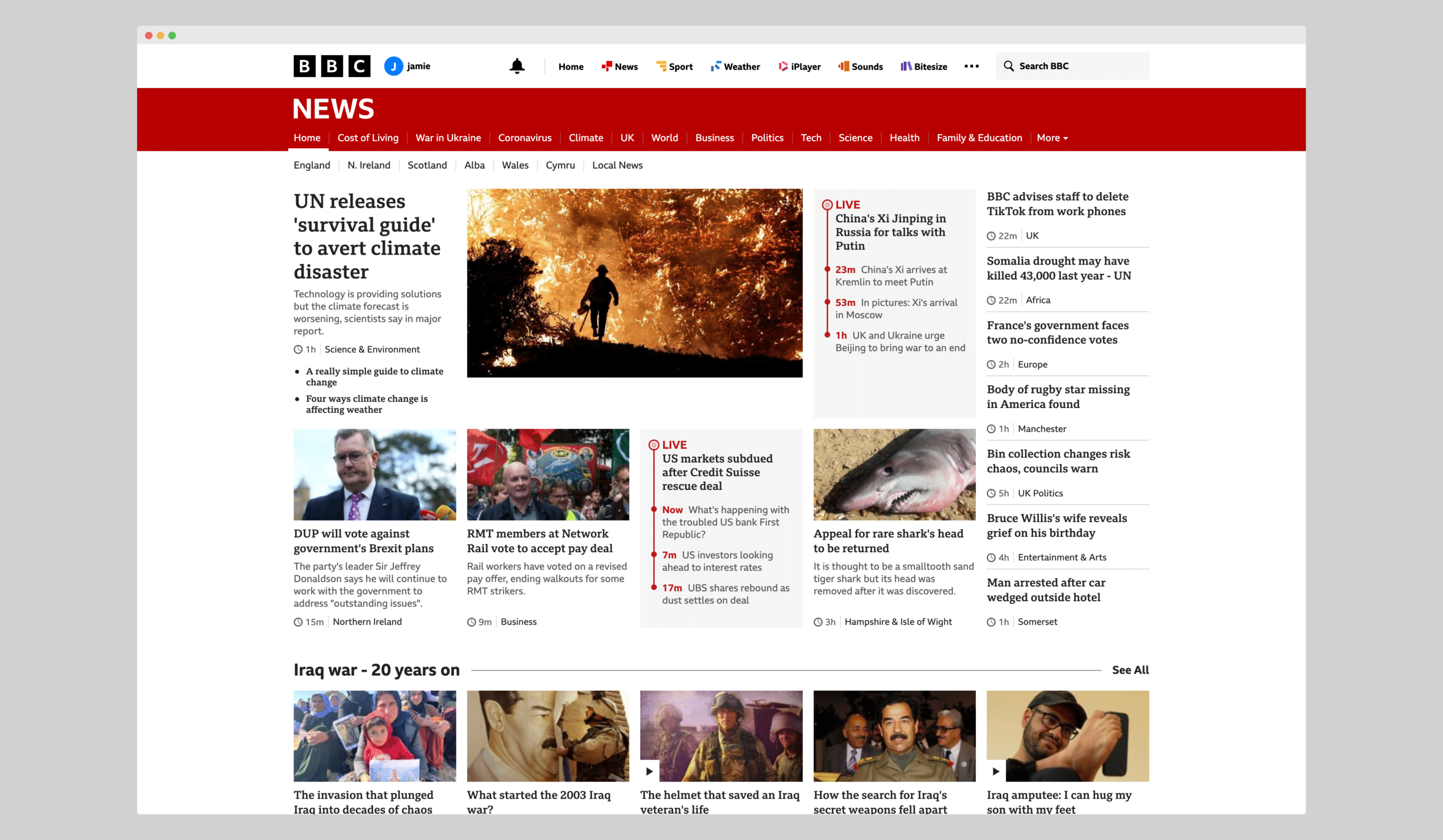
The BBC News website uses visual hierarchy to guide the viewer’s eye towards important news stories, with larger headlines and images given more prominence. Additionally, the use of color and typography is used to create a sense of hierarchy within each story.
Leading Lines
Leading lines are lines within an image that draw the viewer’s eye towards a specific point. In classical painting, this often involved creating diagonal lines that led the viewer’s eye towards the main subject of the painting. In web design, leading lines can be used to draw the viewer’s eye toward important elements on the page and create a sense of movement.
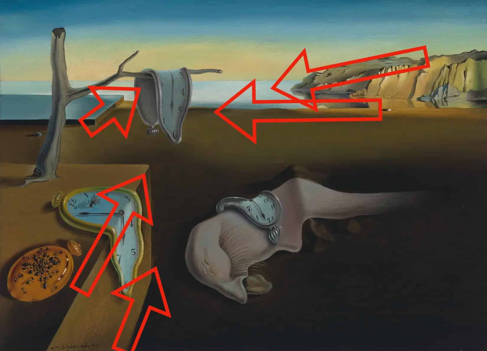
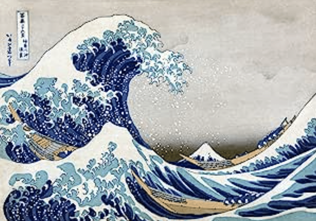
The Persistence of Memory” by Salvador Dali uses leading lines to draw the viewer’s eye towards the central figures of the painting. The painting features several soft, melted watches draped over various objects, with a surreal landscape in the background.
The landscape features a rocky outcropping that curves around the central figures, creating a curved line that leads the viewer’s eye toward the central watches. Additionally, the watches themselves create a sense of movement and flow within the painting, drawing the viewer’s eye toward the center.
Dali’s use of leading lines helps to create a sense of movement and surrealism within the painting, drawing the viewer in and creating a lasting impression.
Here’s a great walkthrough video that shows how to compose a painting with leading lines in mind.
A good example of modern web design that uses leading lines is SquareSpace. The background shape forces the eye towards the heading and the call the action button.
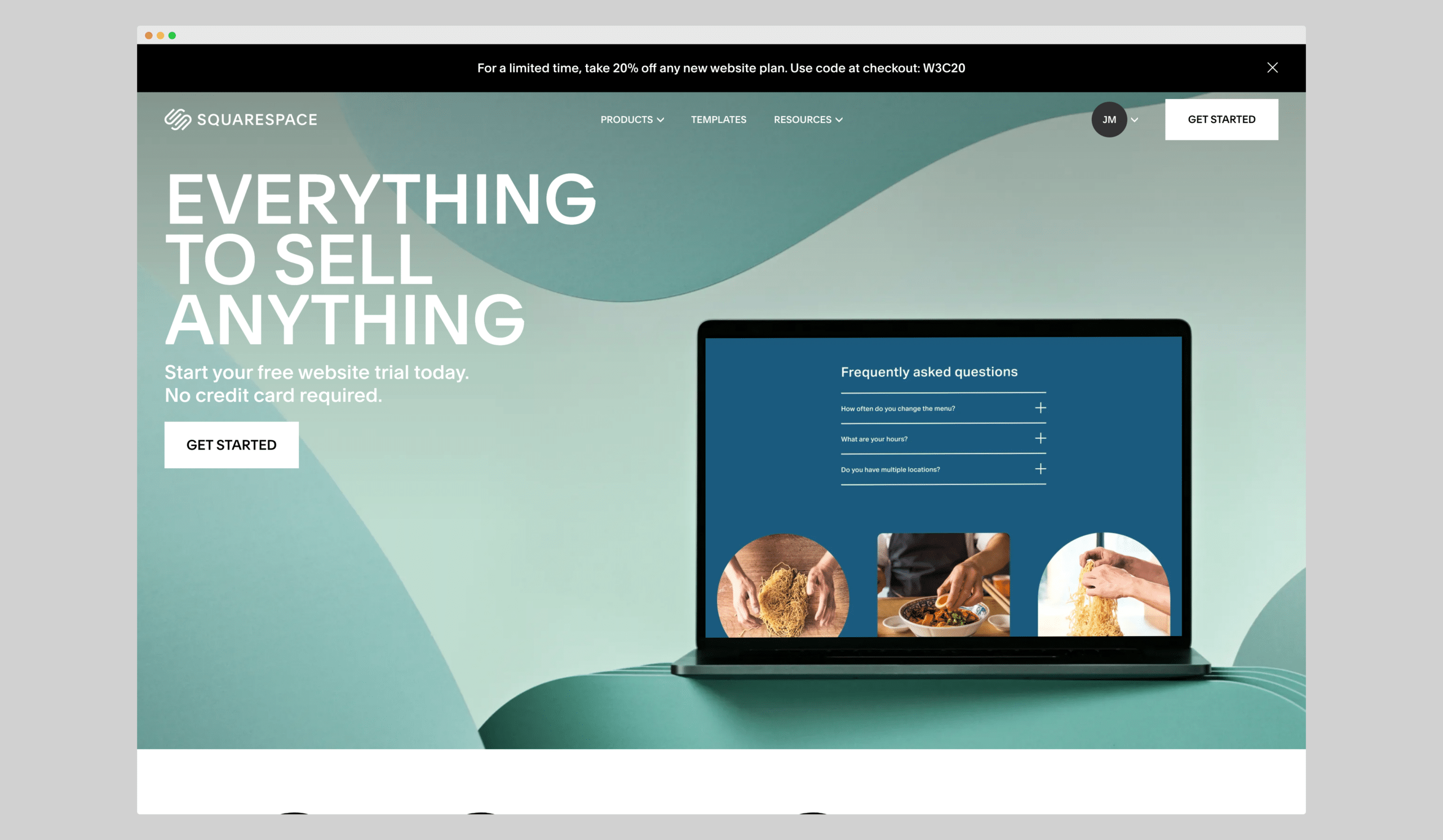
The background shape used in website design is a powerful tool for guiding the viewer’s eye toward important content. By using a shape that contrasts with the surrounding content, the eye is naturally drawn toward the center of the shape, where the designer can position important elements such as headings and calls to action.
For example, a common technique is to use a background shape that is a different color or tone than the surrounding content. This creates a contrast that makes the shape stand out and forces the eye toward the center. In addition, using a shape that is asymmetrical or non-uniform can create a sense of movement and energy that further draws the eye toward the center.
One effective way to use background shapes in website design is to position them behind headings and calls to action. By doing so, the shape creates a visual hierarchy that emphasizes the importance of these elements and encourages the viewer to take action. The shape acts as a visual cue that guides the viewer’s eye toward the most important elements on the page.
In addition, designers can use background shapes to create a sense of depth and dimensionality within the design. By layering shapes on top of one another, the designer can create a three-dimensional effect that adds visual interest and draws the eye towards important elements.
Overall, the background shape is a powerful tool for guiding the viewer’s eye towards important content in website design. By using contrast, asymmetry, and layering, designers can create a visually compelling design that encourages engagement and action.
Symmetry
Symmetry is the arrangement of elements in a balanced and harmonious way. In classical painting, this often involved creating a mirror image of the subject on either side of the canvas.
In web design, symmetry can be used to create a balanced layout and make the page look more aesthetically pleasing.
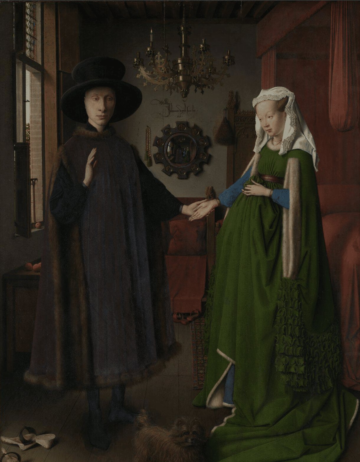
The Arnolfini Portrait” by Jan van Eyck is a classic example of the use of symmetry in art. The painting features a man and a woman, thought to be Giovanni di Nicolao Arnolfini and his wife, standing in a room together.
The painting is notable for its strong sense of symmetry, with the two figures positioned directly across from each other and the various objects in the room arranged in a balanced and harmonious way.
The room itself is also symmetrical, with a centrally located window and identical patterns on either side of the room. This use of symmetry creates a sense of balance and harmony within the painting, drawing the viewer’s eye towards the central figures and giving the painting a sense of stability and order.
Van Eyck’s use of symmetry in “The Arnolfini Portrait” is a hallmark of his style and has made the painting one of the most famous and enduring works of art in history
A good example of modern web design that uses symmetry is Square.
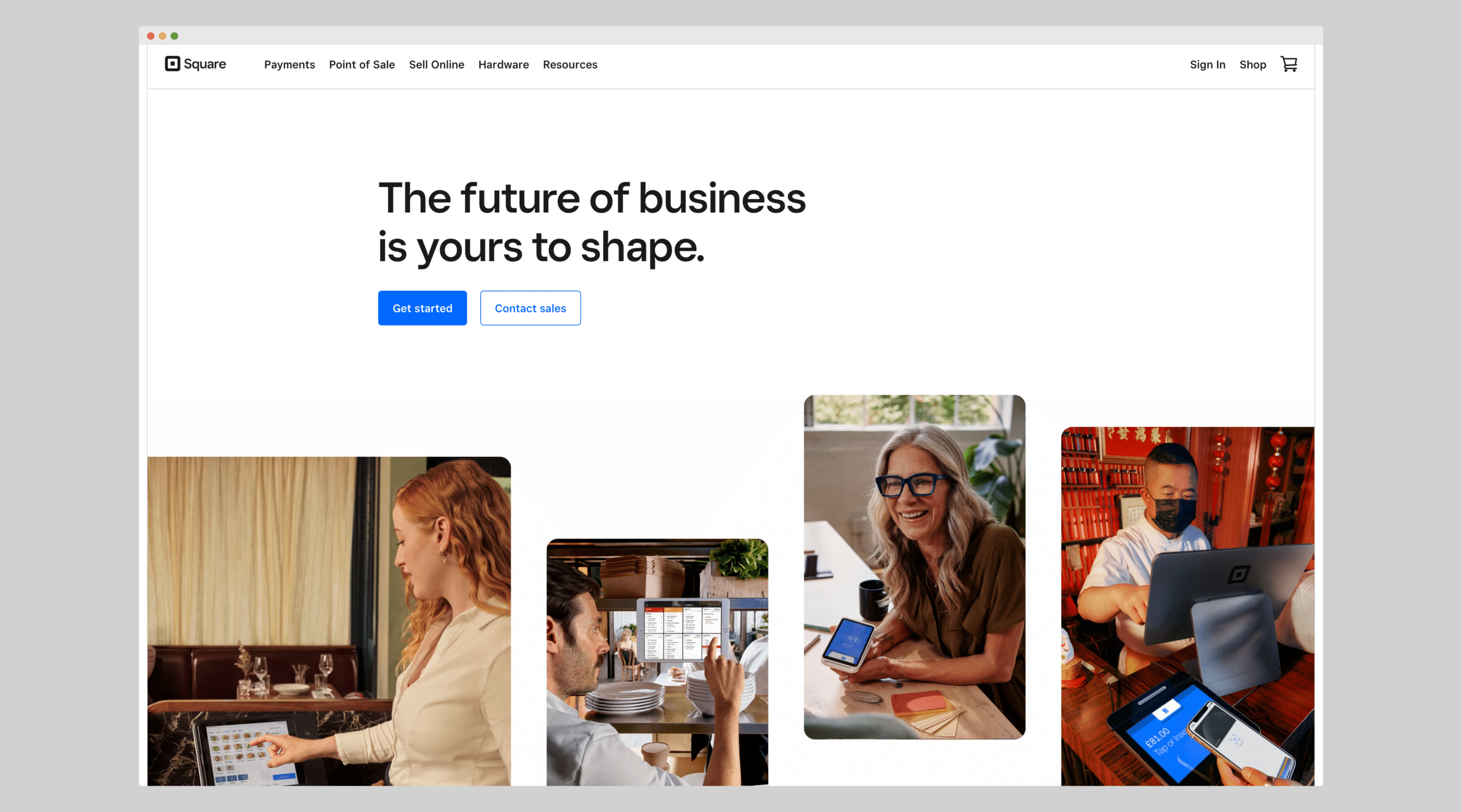
The Square website uses symmetry to create a clean and modern design. The use of symmetrical layouts and grids creates a sense of order and structure that reflects the company’s commitment to simplicity and ease of use.
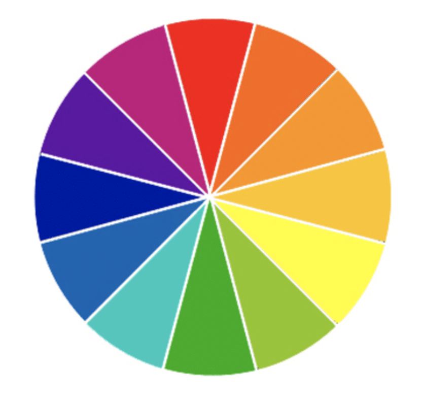
Colour Theory
Colour theory is the study of how colours interact with each other and how they can be used to create different moods and emotions. In classical painting, colour was often used to create contrast and add depth to the image. In web design, colour can be used to create a cohesive colour scheme and draw the viewer’s attention to key elements on the page.
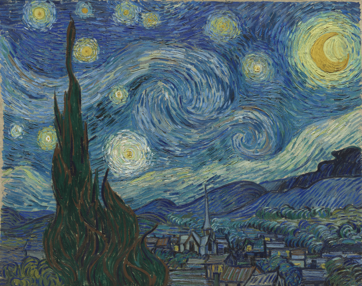
The Starry Night” by Vincent van Gogh uses color theory to create a sense of mood and emotion within the painting. The painting features a dark blue sky filled with swirling stars, with a small town nestled in the foreground. Van Gogh has used a carefully selected color palette to create a sense of harmony and balance within the painting.
Complementary colors are pairs of colors that are opposite each other on the color wheel, such as blue and orange, or red and green. When complementary colors are used together, they create a strong contrast and can help to create a sense of vibrancy and energy in a painting or design.
This is because complementary colors are perceived by the eye to be in opposition to each other, creating a visual tension that can be used to draw the viewer’s eye towards important elements in the composition.
Non-complementary colours, on the other hand, are colour that are not directly opposite each other on the colours wheel. These colours may still be visually pleasing when used together, but they do not create the same sense of contrast as complementary colours.
Designers can use both complementary and non-complementary colors in their work to create different moods and emotions. Complementary colors can be used to create a sense of vibrancy and energy, while non-complementary colours can be used to create a more subdued and harmonious composition.
Understanding colour theory and how to use different colours together effectively is an important skill for designers and artists alike.
The blues and yellows in the painting are complementary colors, which create a sense of contrast and depth.
Additionally, the use of warm, bright yellow in the stars and in the windows of the town creates a sense of hope and optimism, while the dark blue of the sky creates a sense of mystery and wonder.
Van Gogh’s masterful use of colour theory in “The Starry Night” has made it one of the most beloved and iconic paintings in the world
A good example of modern web design that uses color theory is Ikea.
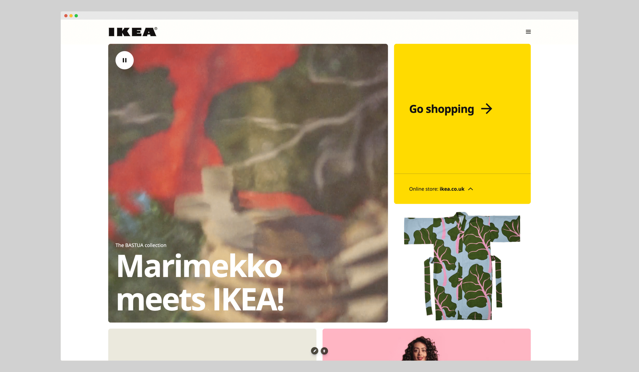
The IKEA website uses a bright and cheerful color palette with shades of blue and yellow, which creates a sense of warmth and welcome. The use of color is carefully controlled to highlight important elements, such as product images and calls-to-action.
Texture
The texture is the surface quality of an object. In classical painting, the texture was often used to create a sense of realism and depth. In web design, texture can be used to create visual interest and make certain elements stand out.
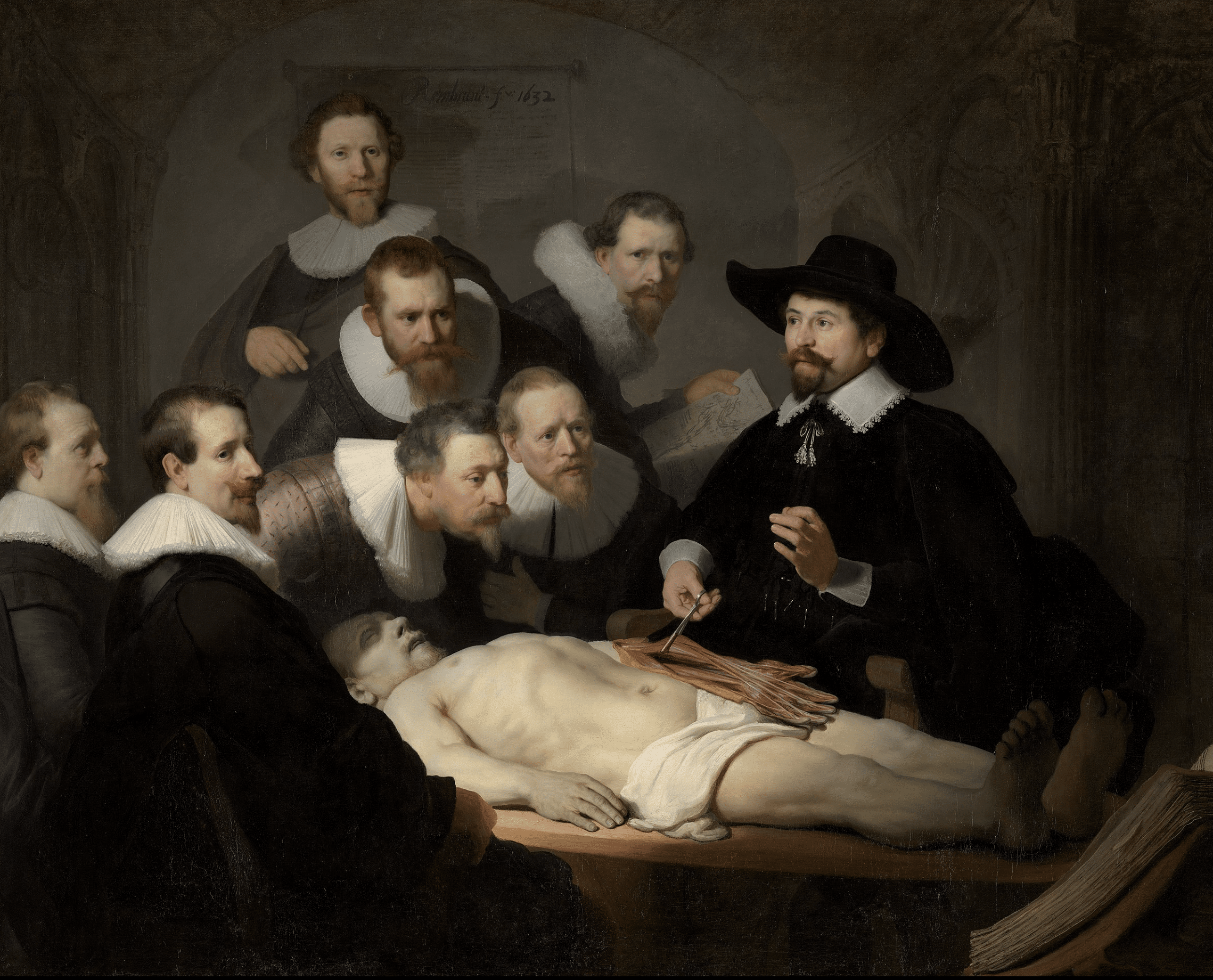
The Anatomy Lesson of Dr. Nicolaes Tulp” by Rembrandt makes use of texture to create a sense of realism and depth within the painting. The painting depicts a group of surgeons gathered around a table, examining a cadaver.
Rembrandt has used a variety of textures to create a sense of depth and realism within the painting. The cadaver’s skin, for example, is depicted with a rough, almost bumpy texture, while the surgeons’ clothing is depicted with a smoother texture.
This contrast in textures creates a sense of depth and realism within the painting, with the viewer able to imagine the rough, cold texture of the cadaver’s skin and the soft, smooth texture of the surgeons’ clothing.
Additionally, Rembrandt has used texture to create a sense of light and shadow within the painting, with the use of thick, impasto brushstrokes creating a sense of depth and three-dimensionality.
Inspiration
Great Art can also be used as inspiration for design. Perhaps the best and most direct example is how The Great Wave off Kanagawa by Hokusai was used as inspiration for the Quicksilver logo.

Art and design have a symbiotic relationship, and it’s common for designers to take inspiration from great works of art. The Great Wave off Kanagawa by the Japanese artist Hokusai is a prime example of a masterpiece that has influenced design.
The Great Wave off Kanagawa is a woodblock print created in the early 19th century. It depicts a powerful wave with Mount Fuji in the background. The image has become iconic and has been reproduced in many forms, including on clothing, stationery, and even as a logo for the Quicksilver surf brand.
The Quicksilver logo takes inspiration from the wave’s powerful and dynamic energy. The logo features a stylized version of the wave, with the brand name written in bold letters above it. The logo has become synonymous with the brand and is instantly recognizable.
This example shows how great art can be a source of inspiration for design. By taking elements from a masterpiece and applying them in a new context, designers can create something fresh and unique.
The Great Wave off Kanagawa is just one of many examples of how art has influenced design throughout history, and it continues to inspire designers today.
Conclusion
By understanding the principles of visual composition and applying them to web design, designers can create websites that are both aesthetically pleasing and functional.
The techniques of rule of thirds, use of light and dark, golden ratio, visual hierarchy, leading lines, symmetry, color theory, and texture have stood the test of time and continue to be relevant today.
By utilizing these techniques, designers can create websites that are visually compelling and engaging for the viewer, ultimately leading to a better user experience and improved website performance.
Leave a Reply