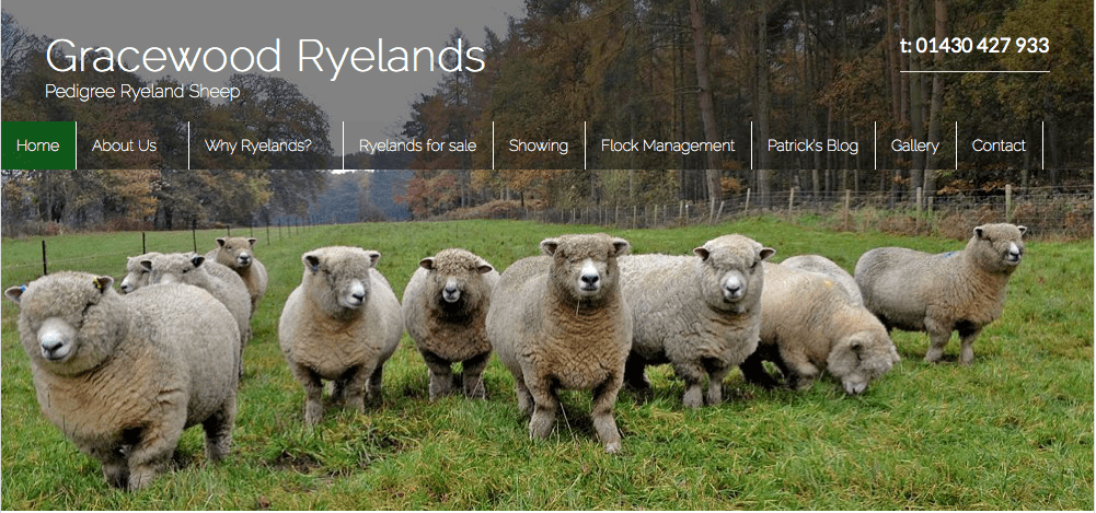
 On one of our recent WordPress Xpress days we were challenged by a really creative design concept (specifically how to create a header, navigation and main image all to look like one stunning hero area). Luckily we know a thing or two about Canvas, so we were able to create this stunning feature.
We also love sharing our knowledge with you all, so knocked up this additional Canvas video tutorial for it.
As usual please use the comments to let us know whether you liked this, whether you want more and any questions or suggestions you have.
Enjoy!
Video tutorial: How to create a beautiful hero concept in WooThemes Canvas
Time to read:
 On one of our recent WordPress Xpress days we were challenged by a really creative design concept (specifically how to create a header, navigation and main image all to look like one stunning hero area). Luckily we know a thing or two about Canvas, so we were able to create this stunning feature.
We also love sharing our knowledge with you all, so knocked up this additional Canvas video tutorial for it.
As usual please use the comments to let us know whether you liked this, whether you want more and any questions or suggestions you have.
Enjoy!
Comments
24 responses to “Video tutorial: How to create a beautiful hero concept in WooThemes Canvas”
-
Hey, thanks for this. Have just started working with Canvas, and find styling certain things a bit tricky (am working with a child theme).
Just wanted to point out that splicing that image into 3 bits would be way easier than cropping! No need to go back and forth and recalculate your cut marks – splices stay put and can be exported in one go.
Also would love to see the moving demo of your slider. As sliders in my mind are meant to rotate – do you have this set up so just your text rotates? Because obviously with this layout you can only have one image for the whole site.thanks for sharing!
-jennyb-
Hi Jenny,
Thanks for the feedback – yes you are right re splicing 🙂
For this demo our slider doesn’t rotate (but it could) . You could achieve just the text rotating by using the same image in each slider.
Jamie
-
-
Absolutely love this! Great tutorial. Will definitely be using the in the future.
-
Thanks Jack 🙂
-
-
Thanks for a great tutorial! Maybe a stupid question but will the menu background image resize for adaptivity on mobile devices? I assume the header-image and the slider will resize?
Goran
-
Hi Goran,
Yes they will resize – but if it was me I would probably switch off the slider for a mobile phone 🙂
jamie
-
-
Great little tutorial and the resulting page looks very nice. I was wondering however what would happen to this on a mobile or tablet screen?
-
I may be missing it, but where is the css for this tutorial?
Thanks!-
Hi Zac,
I’ve just added this for you 🙂
Jamie
-
-
This tutorial couldn’t have come at a better time! A client wants something very similar to this and I was thinking I was going to have to stray from the beloved Canvas theme. Your tutorials are always easy to follow. Thank you.
Heather-
Great thanks Heather 🙂
Jamie
-
-
Hi Jamie — thanks for this tutorial! Will the CSS and techniques shown here work responsively? If viewed on a smartphone or tablet, what would happen?
Cheers, Chris
-
Hi Chris,
Well if it was me i would switch off the slider for a mobile – i might even use a different header 🙂
Jamie
-
-
What (another) great video Jamie. Love that idea of the three areas flowing together. Now I need to find a site I can do this for.
-
Thanks Keith,
Send me a link if you ever find a site to build this for 🙂
Jamie
-
-
Hi Jamie, this is a great and quick tutorial for a fantastic look for Canvas. Do you if there is a way to get the menu background image to be full-width? I’m trying to recreate this Hero look in a full width layout.
-
I enjoyed that http://fluidwebdevelopment.com/BigPicture/.
Just a mock site but I like the way the top of the lighthouse is carried through all of the pages and menu’s
I’d be interested in making it look better on a mobile though.
-
Love it 🙂
-
-
This works great except dropdown menus need a background. Any suggestions on that? Thanks.
-
Hi. Great tutorial. But, before i’ll go on doing this on one of my customers sites. Please tell me if this works on full width canvas?
-
Yes it should 🙂
-
-
Hi,
I love your site and have had lots of help from it so far but my efforts with this hero concept are meeting little luck. I’m very much a beginner & am working in Instant WordPress at the moment. There are a few issues I’d like help with.
1. I can’t get the first bit about taking a shot of the canvas screen. (I know how to take a screen shot but don’t know what to do with it once I get it.)
2. The slider is either too big or too small for the screen. I’ve tried re-sizing it in Photoshop but don’t seem to be able to get it right.
3. Although I’ve inserted your code for the menu into custom.css, the menu background appears much narrower than the header or slider.
Thanks,
Margaret
-
Hey Jamie, I’m have the same issue as Margaret. Especially numbers 2 & 3. Give the updates to Canvas I have been playing around with the full width option and the “hero” image with transparent background navigation. Not there yet. More tweaking required. Any thoughts to updating the video, or do you have any other resources you would consider sharing. Thanks in advance. rite
-
Hello! I have a quick question about this. We use a newer dynamic image resizing script that allows us to take a 1600px wide image and make it work in something as wide as a 2000+ dpi high def screen. Will the code still work? Thanks!
Leave a Reply